
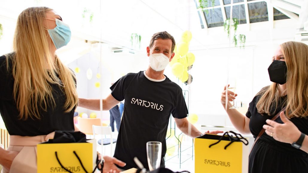
[이벤트] International Brand Awards – A Successful Transformation
A new brand promise, a new logo, and new colors – in 2020 Sartorius successfully underwent a rebranding. The 2020 relaunch of the Sartorius corporate brand was all about the new brand promise “Simplifying Progress”. This strategic repositioning and relaunch of the brand has earned Sartorius a variety of awards.
Sartorius looks different today than it did one and a half years ago. As a leading international partner of life science research and the biopharmaceutical industry, Sartorius decided to sharpen its brand identity in order to better reflect the work Sartorius does as a partner to enable scientific breakthroughs in life science research and biomanufacturing. The essence of Sartorius being part of the solution has been captured through the new claim and brand promise: Simplifying Progress.
These words express the Sartorius aim to simplify the work customers do and help them to achieve medical progress faster with the tools and technologies Sartorius builds. The new promise “Simplifying Progress” now clearly differentiates Sartorius in a rather traditional and complex field. The rebranding revolves around embodying the identity of simplifying progress, by simplifying everything from the brand look to the products that make processes simple for customers. To mirror the brand promise, Sartorius also revised its look and consolidated its profile at the subgroup and division levels to underscore its new brand claim. A one-brand policy has been adopted to enhance brand recognition and create a more unified and straightforward brand.
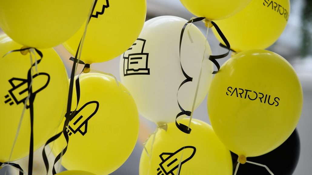
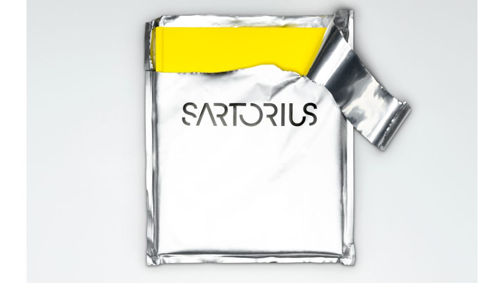
With pure and bold colors, and a clean-cut typography, Sartorius is emphasizing its ambition through its corporate look.
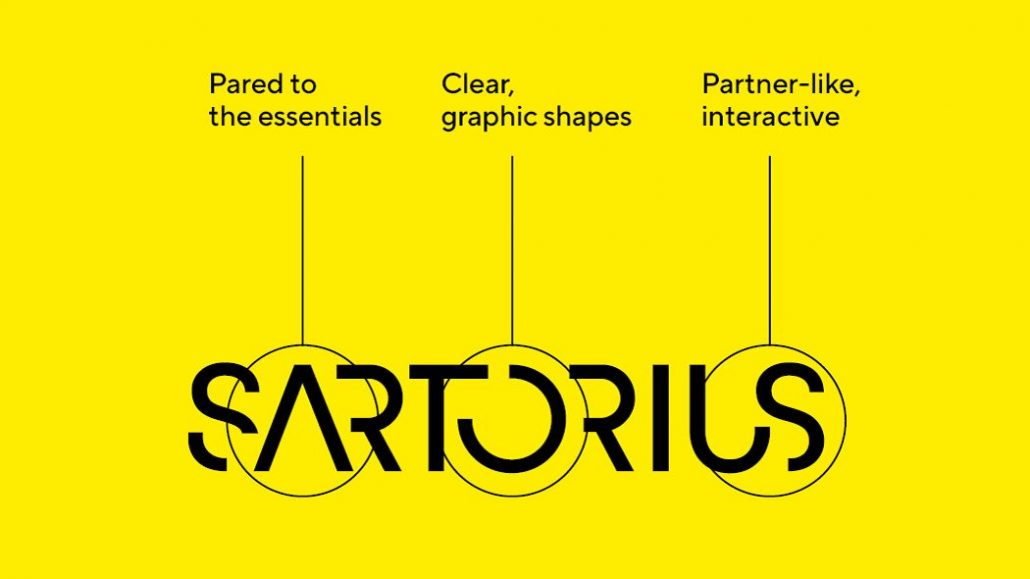
As a result of the one-brand strategy, the new logo represents the entire Sartorius Group. It now clearly distinguishes Sartorius in the biopharma industry. The engaging potential of the design lies within its simplicity: the bold logo omits unnecessary lines, icons, or pictures. This underlines the brand promise “Simplifying Progress”: reduced shapes transport focus, the capitalized characters express Sartorius’ bold and pioneering spirit and the gaps stand for the open and accessible attitude. The color palette consists of just three colors: all one hundred percent pure. While competitors mainly use blue and red, the Sartorius brand is uniquely positioned with pure yellow. The result is a distinct, eye-catching appearance – a unique and pioneering brand.
An integrated concept based on our brand promise – the new branding was recognized with a series of international design awards in a variety of categories.
Sartorius is proud of the achievements in not only transforming the brand identity and creating a new strategic approach to what it means to be Sartorius, but also being recognized for these efforts.
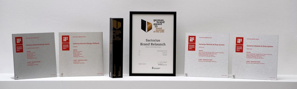
The relaunch of the brand received the following awards from the iF Design Award 2021, German Brand Award 2021, and ADC Award 2021.
Red Dot Design Award 2021
- A total of five awards for the Sartorius brand relaunch, Medical & Healthcare Sector brand, pictogram system, packaging, and the Sartorius Brand Platform
Corporate Design Preis 2021
- A total of three awards for the corporate design | Redesign, the corporate trademark and logotype design, and packaging
iF Design Award 2021:
- A total of four awards for the brand platform (2), and the website and shop system (2).
German Brand Award 2021:
- A total of four awards for the brand strategy (Best of Best and winner), best brand in Health & Pharmaceuticals (Gold – Best Brand), and corporate brand of the year (winner).
ADC Award 2021:
- One award for brand identity and design (bronze).
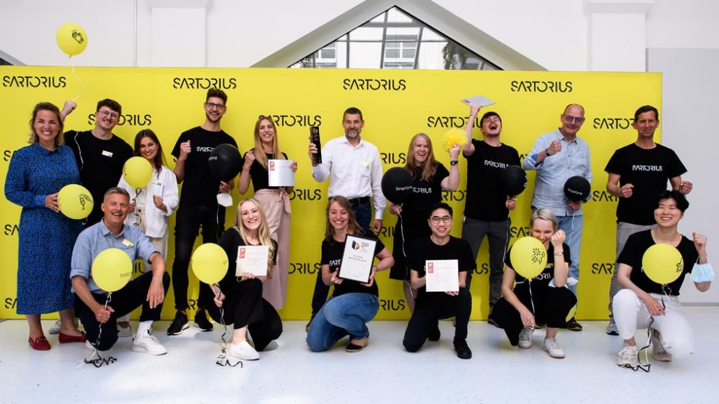
These awards demonstrate that Sartorius and the new brand are convincing and deliver across the board, from theory and strategy to corporate design and the implementation of individual touchpoints. Sartorius continues to take various measures to expand its ability to make the brand tangible to the outside world and to live it consistently. Sartorius is taking on a pioneering role in its industry – in line with the motto: Simplifying Progress.
“The awards are a recognition of the great work of everyone involved in the implementation of the new Sartorius brand. My respect goes to the teams from Corporate Branding & Design and eBusiness, but also to other units and external partners who supported us in the process,” says David Fehlberg, Head of Corporate Branding & Design.
The wide range of categories in which Sartorius was awarded demonstrates that we were successful in creating a fully integrated concept, starting with the Sartorius brand model, deriving the corporate design directly from our brand promise “Simplifying Progress” and ending up with translating it to all touchpoints.
David Fehlberg, Head of Corporate Branding & Design
At all touchpoints, the focused, creative and ambitious brand character that is Sartorius comes alive. Sartorius is proud of its team and their success in creating a new, dynamic, and simplified brand identity to drive the company forwards on every front.

